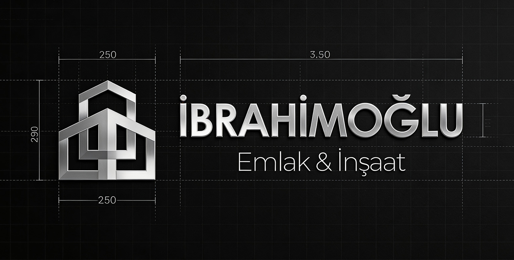
Final logo lockup and primary identity mark — Aether Capital Brand System 2024
The Challenge
A well-established company entering
a new era.
İbrahimoğlu İnşaat & Emlak had been operating with a traditional identity shaped by conventional construction and real estate branding standards. As the company evolved toward a more modern, premium, and design-conscious vision, its visual language no longer reflected the scale, professionalism, and contemporary lifestyle it aimed to represent.
The brief was clear: transform İbrahimoğlu into a sophisticated and future-focused brand while preserving the sense of trust, reliability, and experience that had been built over the years.
The Approach
Where trust meets
vision.
Rather than completely abandoning the company’s roots, the strategy focused on refined evolution. We preserved the qualities that established credibility over the years — reliability, structural strength, and professional discipline — then reinterpreted them through a cleaner, more contemporary design language.
The result is a brand identity that feels both timeless and forward-looking: a visual system that reflects the confidence, quality, and modern perspective İbrahimoğlu İnşaat & Emlak represents today.
01
Discovery & Audit
Competitor landscape analysis, stakeholder interviews, and a full audit of the existing identity's equity and liabilities.
02
Strategy & Positioning
Brand archetype definition, value proposition clarity, and a verbal identity framework that guided every visual decision.
03
Identity Design
Logo exploration across 40+ directions, refined to three routes, selected and refined into the final mark and wordmark system.
04
System Build
Full design system documentation — color, type, spacing, motion, iconography, and usage guidelines for internal teams.
Logo system — mark scale hierarchy and dark/light wordmark variants
Color System
A palette built
for authority.
Typography
Type that
commands.
Display / Headlines
Hellix
Bold
Body / Subheadings
Precision-crafted investment strategies built for the discerning, the ambitious, and those who understand that exceptional returns require exceptional thinking.
Monospace / Data
JetBrains Mono veya IBM Plex Mono
Application suite — app icon, envelope system, and motion identity guidelines
Outcome
Numbers that
speak.
3.2×
Increase in new client inquiries within 60 days
97%
Client satisfaction in brand perception surveys
$2.4B
AUM milestone reached in the launch quarter
"
“The process went far beyond designing a logo or a visual identity — it established a complete brand language that truly represents the future of our company. Every detail, from the business cards to the digital applications, now reflects a more modern, trustworthy, and professional image. The transformation in how our brand is perceived today is a direct result of the vision and precision behind this work.
MK
Cafer İbrahimoğlu
İbrahimoğlu İnşaat & Real Estate